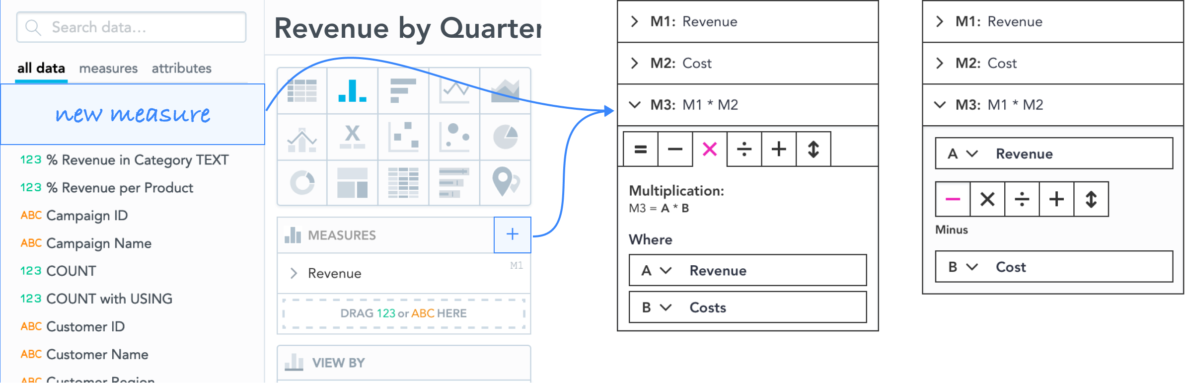
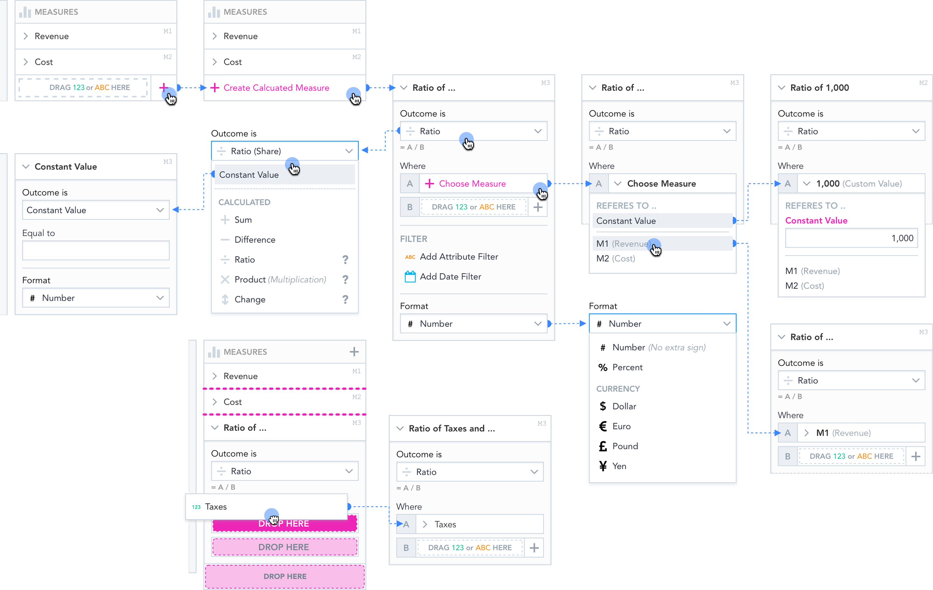
Simple Measure Builder
Analytics for school bookkeepers. No SQL. No analysts. No waiting.
Before
👨💼 Ellen, what were our earnings last year?
I don't know exactly. Give me a sec. 👩💼
/* copies numbers to a different tool and gets the result elsewhere */
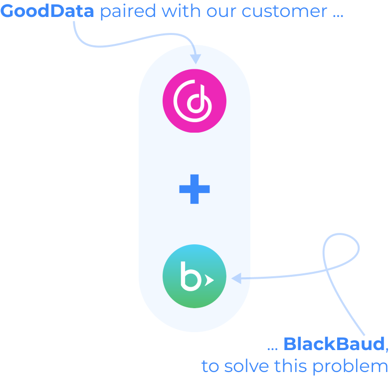
The workaround
- Submit ticket to BlackBaud
- Wait for the metric to be created
- Export data, calculate in Excel
- Bring back a number already out of date
After

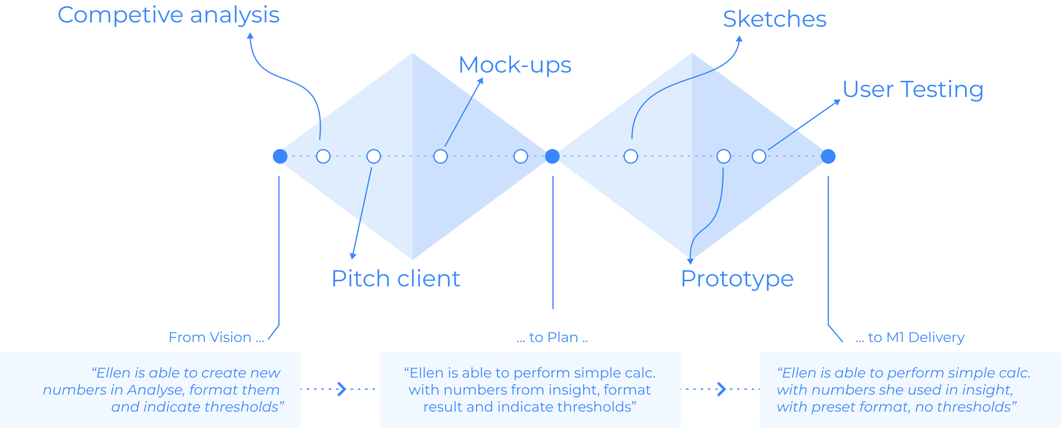
Role
Senior Product Designer
Scope
Discovery · Research · Concept · Validation · Delivery
Method
Double Diamond